Everest
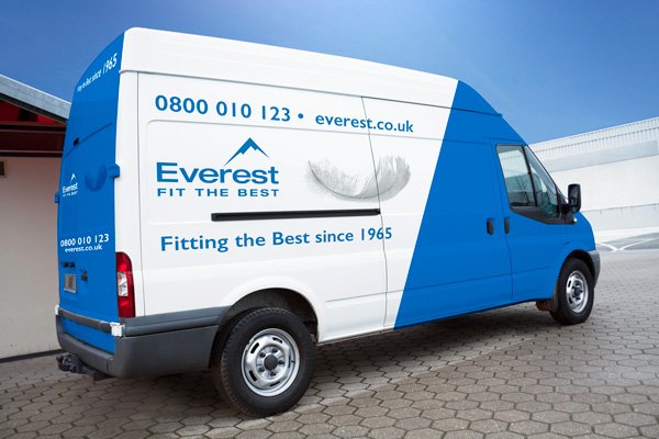
The Everest brand has been around for a long time, 50 years in fact. We were tasked with a brand refresh, moving the brand forward whilst embracing it’s past. Our solution was a new logo, an evolution, bringing back their iconic blue & making the typography & tagline bolder. This allowed the logo to really stand out across the rich variety of media it would be displayed, be it digital, print, outdoor or TV. The logo launched alongside their ‘Price Rewind’ campaign, a promotion which took their prices back to 1991.
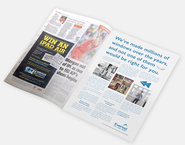
Part of Everest’s advertising heritage was their famous long copy press work, specifically those featuring Brain of Britain Ted Moult. Having taken the brand back to its traditional blue colour and ‘Fit the best’ mantra, it only seemed right we took their print ads back to their original best as part of the Price Rewind campaign too.
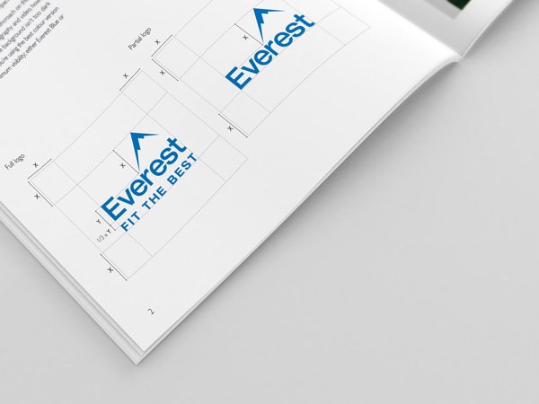
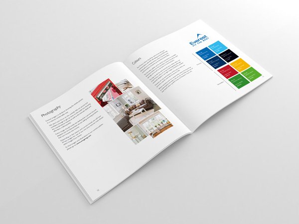
Logo refresh/brand guidelines
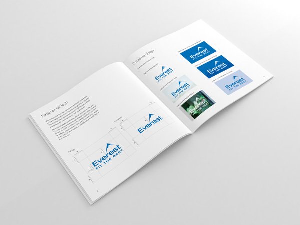
Brand Guidelines
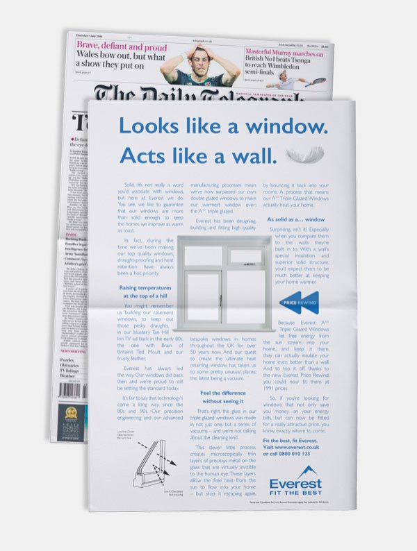
Long copy press
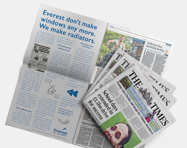
Long copy press
-
Role Graphic Designer
Up Next: